A primer on Bayesian mixed-effects models. 
A primer on Bayesian mixed-effects models
knitr::opts_chunk$set(cache = TRUE, fig.width = 8, fig.height = 5)

set.seed(191016)

#install.packages("INLA", repos=c(getOption("repos"), INLA="https://inla.r-inla-download.org/R/stable"), dep=TRUE)

library(dplyr)
library(ggplot2)
library(INLA)
library(malariaAtlas)
Intro
This primer is an introduction to mixed effects models. I’m presenting it by using Bayesian mixed-effects models but that’s because they are easier to understand. The hope is that from here it will be relatively easy to understand frequentist mixed-effects models. Or at least, have the intuition of what the models are doing. I still don’t understand the nuts and bolts of frequentist mixed-effects models.
The aim of the primer is to explain the real fundementals of what mixed effects-models are, why you might use them and how they do what they do. This last bit (the how), is what is missed from many courses because the how in frequentist mixed-effects models is complicated. However, in Bayesian mixed-effects models, the how is very simple, and follows on entirely smoothly from any other Bayesian analysis. In this case, I think understanding how they work also makes the what and the why easier to understand.
As an overview, we will look at some data and define some mathematical models to answer some questions of interest. Then we will fit those same models in a least squares framework, a normal Bayesian framework and finally a mixed-effect framework.
Download the data
We’re going to get data using the malariaAtlas package The data will be prevalence surveys from Asia. To keep things simple we are going to completely ignore the sample size for each survey. Instead we will simply do a log(x + 0.1) transform (that will approximately normalise things) and use that as our response.
d <- getPR(continent = 'Asia', species = 'Pf')

## Confirming availability of PR data for: Asia...

## PR points are available for Asia.

## Attempting to download PR point data for Afghanistan, Indonesia, India, Yemen, Cambodia, Bangladesh, Vietnam, Pakistan, Philippines, Nepal, Thailand, China, Tajikistan, Myanmar, Laos, Malaysia, Sri Lanka, Iraq, Saudi Arabia, Turkey, Timor-Leste, Bhutan ...

## Data downloaded for Asia.

names(d)

##  [1] "dhs_id"                    "site_id"
##  [3] "site_name"                 "latitude"
##  [5] "longitude"                 "rural_urban"
##  [7] "country"                   "country_id"
##  [9] "continent_id"              "month_start"
## [11] "year_start"                "month_end"
## [13] "year_end"                  "lower_age"
## [15] "upper_age"                 "examined"
## [17] "positive"                  "pr"
## [19] "species"                   "method"
## [21] "rdt_type"                  "pcr_type"
## [23] "malaria_metrics_available" "location_available"
## [25] "permissions_info"          "citation1"
## [27] "citation2"                 "citation3"

dtime <- d %>%
          filter(!is.na(examined), !is.na(year_start)) %>%
          mutate(log_pr = log(pr + 0.1)) %>%
          select(country, year_start, log_pr, pr)
We will ask two broad questions.
- What was the malaria prevalence in Asia and in each country 2005 - 2008 (ignoring any remaining temporal trends).
- How did malaria change through time in Asia and in each country.
To keep this clear we will make two seperate datasets.
dmean <- dtime %>% filter(year_start > 1999, year_start < 2005)
So that we can plot our predictions nicely we should make some predictive data.
dmean_pred <- data.frame(country = unique(dmean$country))
dtime_pred <- expand.grid(country = unique(dtime$country), year_start = 1985:2018)
Let’s summarise and plot the data.
dmean$country %>% table

## .
##  Afghanistan   Bangladesh       Bhutan     Cambodia        China
##           64            0            0          187           25
##        India    Indonesia         Iraq         Laos     Malaysia
##           76          124            0           20            0
##      Myanmar        Nepal     Pakistan  Philippines Saudi Arabia
##           26            0            0            0            0
##    Sri Lanka   Tajikistan     Thailand  Timor-Leste       Turkey
##            0            2           72           11            8
##      Vietnam        Yemen
##           67           26

dmean$year %>% table

## .
## 2000 2001 2002 2003 2004
##   79  111  192  209  117
Question one: what was the mean malaria prevalence per country in the period 2000 - 2004
- Note that some countries like Tajikistan and Turkey have very little data. How do we estimate their mean?
- Also note, the data is very unbalanced. How do we estimate the Asia total without the estimate being dominated by Indonesia?
dmean <- dmean %>%
group_by(country) %>%
mutate(n = n())
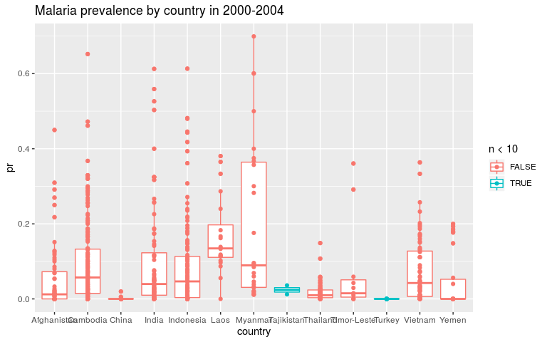
ggplot(dmean, aes(x = country, y = pr, colour = n < 10)) +
geom_boxplot() +
geom_point() +
ggtitle('Malaria prevalence by country in 2000-2004')
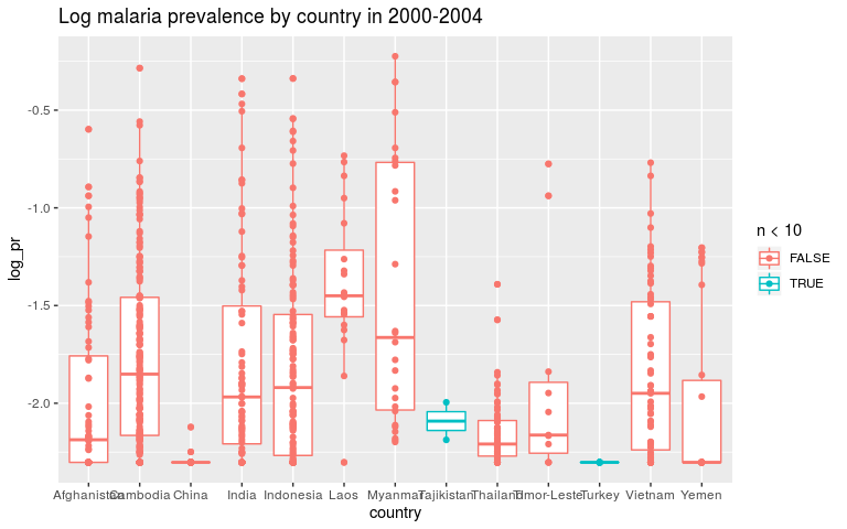
ggplot(dmean, aes(x = country, y = log_pr, colour = n < 10)) +
  geom_boxplot() +
  geom_point() +
  ggtitle('Log malaria prevalence by country in 2000-2004')
Discuss mathematical models and estimate with least squares
We can look at the structure of our mathematical models, and the way we
estimate the parameters completely seperately. So we can think of the
structure of a model and then estimate it with least square (lm()) as
a simple way to start getting intuition about what things look like.
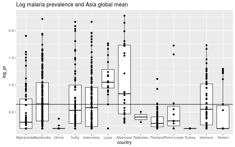
Starting with the first question, we can start with a model with one, global intercept.
y = β0
m1 <- lm(log_pr ~ 1, data = dmean)
coefficients(m1)

## (Intercept)
##    -1.85726

ggplot(dmean, aes(x = country, y = log_pr)) +
  geom_boxplot() +
  geom_point() +
  ggtitle('Log malaria prevalence and Asia global mean') +
  geom_abline(slope = 0, intercept = m1$coef[1])
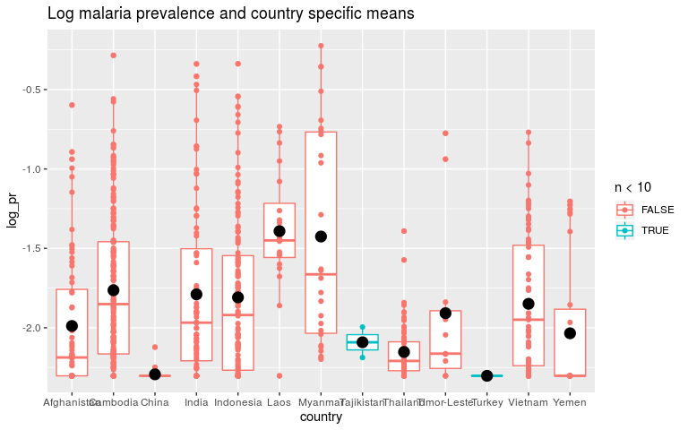
As our aim is actually to estimate the mean malaria prevalence for each country, we need country to go in as a categorical variable.
y = β0 + β.country
It may be helpful to think about this in the explicit way it is encoded. We have 13 countries. The ideal model would be 1 global mean and 13 country specific parameters.
y = β0 + β1.AFG + β2.KHM + β3.CHN + …
(I’m using ISO3 codes here. KHM is Cambodia or Khmer) Internally, R converts the 1 categorical variable into binary variables. Variable 1 is “is this row in AFG?”, variable 2 is “is this row in KHM?” etc.
So as these variables have a 1 if the row is in a given country and a zero otherwise, a prediction for Afghanistan will be zeroes for all the terms except β0 and β1.
Unfortunately we now have to make a quick detour. This parameterisation is unidentifiable (the data cannot tell us the answer because there are multiple answers that fit the data equally likely). If we think about the same model with just two countries, how could the model know whether the intercept is high or both country-level parameters are high? When we switch to mixed-effects models we will have a global intercept and 13 country specific parameters. But for now we will have a global intercept and 12 country level parameters. The first country is taken as the “reference class” and combined with the global intercept. Mostly, we can think about the models in the same way however.
So now we can estimate this model with least squares
m2 <- lm(log_pr ~ country, data = dmean)
coefficients(m2)

##        (Intercept)    countryCambodia       countryChina
##         -1.9885722          0.2247165         -0.3045652
##       countryIndia   countryIndonesia        countryLaos
##          0.1992390          0.1799838          0.5971321
##     countryMyanmar  countryTajikistan    countryThailand
##          0.5630916         -0.1027141         -0.1637883
## countryTimor-Leste      countryTurkey     countryVietnam
##          0.0803858         -0.3140129          0.1394583
##       countryYemen
##         -0.0461457

pred2 <- data.frame(dmean_pred, pred = predict(m2, newdata = dmean_pred))


ggplot(dmean, aes(x = country, y = log_pr, colour = n < 10)) +
  geom_boxplot() +
  geom_point() +
  geom_point(data = pred2, aes(country, pred), colour = 'black', size = 4) +
  ggtitle('Log malaria prevalence and country specific means')
Now switch to Bayes and remind ourselves what priors are.
Bayesian mixed modelling is essentially taking the above model structures and doing clever things with priors. First we’ll do more standard things with priors to remind ourselves what they mean.
A prior is how we tell the model what is plausible based on our knowledge before looking at the data. The intercept in our model is the average malaria prevalence across Asia (in log space). Is prevalence of 1 (in prevalence space) reasonable? No! So our prior should tell the model that this is very unlikely.
So first let’s fit our model in a Bayesian framework with INLA. The priors on fixed effects here are normal distributions with a mean and precision (1/sqrt(sd)). For our first model we are putting very wide priors on the parameters which should give us parameter estimates very similar to the least squares estimate.
In the first model, the global intercept was dominated by countries with lots of data like Indonesia. These data aren’t independant because we expect the data within Indonesia to be more similar than the data between Indonesia and other countries. If we were independantly sampling each person in Asia, China and India would have a lot more data than Cambodia! When people talk about autocorrelation in the data and mixed-models this is what they are referring to. While removing this autocorrelation is good, most of the statistical power will go into learning country level intercepts, not the global mean.
# easiest way to predict with INLA is to put the prediction data in with NAs in the Y column.

dmean_both <- bind_rows(dmean, dmean_pred)

pred_ii <- which(is.na(dmean_both$log_pr))

# Very vague priors first.

priors <- list(mean.intercept = -2, prec.intercept = 1e-4,
               mean = 0, prec = 1e-4)

bm1 <- inla(log_pr ~ country, data = dmean_both,
            control.fixed = priors,
            control.predictor = list(compute = TRUE))

predb1 <- data.frame(dmean_pred, pred = bm1$summary.fitted.values[pred_ii, 1])


ggplot(dmean, aes(x = country, y = log_pr, colour = n < 10)) +
  geom_boxplot() +
  geom_point() +
  geom_point(data = predb1, aes(country, pred), colour = 'black', size = 4) +
  ggtitle('Log malaria prevalence. Bayesian means with vague priors.')
Now let’s say that we think all countries are fairly similar. To encode that in the prior we say that the βi’s should be small. INLA works with precision (1/variance) so high precision is a tight prior around 0.
This is “pooling”. Our estimates for countries with not much data will be helped by information from the other countries.
Our estimates for the global mean will be dominated by countries with lots of data. But we won’t have put all our statistical power into learning the country level parameters.
priors <- list(mean.intercept = -2, prec.intercept = 1e-4,
               mean = 0, prec = 100)

bm2 <- inla(log_pr ~ country, data = dmean_both,
            control.fixed = priors,
            control.predictor = list(compute = TRUE))

predb2 <- data.frame(dmean_pred, pred = bm2$summary.fitted.values[pred_ii, 1])


ggplot(dmean, aes(x = country, y = log_pr, colour = n < 10)) +
  geom_boxplot() +
  geom_point() +
  geom_point(data = predb1, aes(country, pred), colour = 'black', size = 4, alpha = 0.3) +
  geom_point(data = predb2, aes(country, pred), colour = 'black', size = 4) +
  ggtitle('Log malaria prevalence. Strong, pooling priors.') +
  labs(subtitle = 'Least squares estimates in grey. Estimates pulled towards global mean.')
THE CRUX
So if we think that all countries are quite similar, we should put a strong prior on the country level parameters. For countries with little data this means our estimates are close to the global mean. This is “pooling”. But it also means the global estimate will be dominated by countries with lots of data.
If we think that countries are quite dissimilar, we should put a weak prior on the country level parameters. For countries with little data, our estimates will be noisey, but maybe that’s better than them being biased towards the mean. Our global estimate won’t be dominated by any one country.
The problem then is how similar are countries. Often, we don’t know. So how do we set our priors sensibly. The answer is mixed-effects models.
Mixed-effects model
Our models above looked like this: y = β0 + β1.AFG + β2.KHM + β3.CHN + … β0 ∼ Norm*(−2, 10000) *β**i* ∼ *Norm(0, 0.001)
We are now saying “we don’t know what number to choose instead of 0.001”. So, along with the rest of the model we will estimate it. We don’t know how different the different countries are, so we will let the data tell us.
To do this, we switch the 0.001 for a new variable, σ and put a prior on sigma. y = β0 + β1.AFG + β2.KHM + β3.CHN + … β0 ∼ Norm*(−2, 10000) *β**i* ∼ *Norm(0, σ) σ ∼ some prior distribution Mixed-effects models are also called hierarchical models for this reason, the prior on the prior is hierarchical.
So, now if the countries that do have lots of data are very different from each other, the model will learn that σ must be quite big. Therefore the countries with little data will not be pulled towards the mean much. If the countries with lots of data are very similar, then a country with little data should be pulled towards the mean. If the few data points lie far from the global mean then probably it’s just by chance.
Setting hyperpriors can be awkward. Note that σ must be positive so we need a prior that reflects that.
Recently Penalised complexity priors have been developed and they are much more intuitive. You choose a “tail value”: What is the largest value of σ that is reasonable? You then tell the model that the probability that σ is greater than that value is a small probability (1% or something).
So for now we’ll say P(σ > 0.1)=1%.
priors <- list(mean.intercept = -2, prec.intercept = 1e-4)
hyperprior <-  list(prec = list(prior="pc.prec", param = c(0.1, 0.01)))

f <- log_pr ~ f(country, model = 'iid', hyper = hyperprior)
mm1 <- inla(f, data = dmean_both,
            control.fixed = priors,
            control.predictor = list(compute = TRUE))

mm1$summary.hyperpar

##                                              mean         sd 0.025quant
## Precision for the Gaussian observations  4.938214  0.2654638   4.433231
## Precision for country                   32.062486 11.9888290  14.787373
##                                          0.5quant 0.975quant      mode
## Precision for the Gaussian observations  4.932598   5.476931  4.922921
## Precision for country                   30.018967  61.137516 26.332045

1 / mm1$summary.hyperpar$mean[2]

## [1] 0.0311891

predm1 <- data.frame(dmean_pred, pred = mm1$summary.fitted.values[pred_ii, 1])

ggplot(dmean, aes(x = country, y = log_pr, colour = n < 10)) +
  geom_boxplot() +
  geom_point() +
  geom_point(data = predb1, aes(country, pred), colour = 'black', size = 4, alpha = 0.3) +
  geom_point(data = predm1, aes(country, pred), colour = 'black', size = 4) +
  ggtitle('Log malaria prevalence by country in 2000-2004 (pooling priors)')
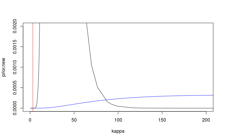
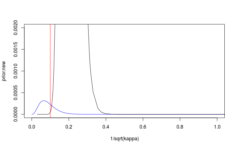
We can look at the prior and posterior for the hyperparameter that governs the strength of the prior. We can look at this on the internal precision scale used by INLA. We said that the prior probability that the precision is less that 3.1 is 1%. On the sd scale we said the prior probability that the sd is greater than o.1 is 1%. I’ve plotted these in red lines. They don’t seem quite right but at least on the right side.
I’m also not 100% sure that my scaling here is correct. The posterior (black) looks very wide and high.
# These plots mess up knitr...
#plot(mm1, plot.lincomb = FALSE, plot.random.effects = TRUE,
#    plot.fixed.effects = FALSE, plot.predictor = FALSE,
#    plot.prior = TRUE)
#abline(v = 10, col = 'red')


# Plot the posterior on precision scale
plot(mm1$marginals.hyperpar$`Precision for country`, type="l", xlim=c(0, 80))
# Plot the prior then add posterior
kappa <- exp(seq(-5, 15, len=10000))
prior.new = inla.pc.dprec(kappa, 0.1, 0.01)

plot(kappa, prior.new, col = 'blue', type = 'l', xlim = c(0, 200), ylim = c(0, 0.002))
lines(mm1$marginals.hyperpar$`Precision for country`)
abline(v = 3.1, col = 'red')
# Plot the posterior on sd scale
sd_scale <- mm1$marginals.hyperpar$`Precision for country`
sd_scale[, 'x'] <- 1/sqrt(sd_scale[, 'x'])

plot(sd_scale, type="l", xlim=c(0, 1))
# Plot prior on sd scale.
plot(1/sqrt(kappa), prior.new, col = 'blue', type = 'l', xlim = c(0, 1), ylim = c(0, 0.002))
lines(sd_scale)
abline(v = 0.1, col = 'red')
Bit more on priors
Between working out what scale you’re using (variance, sd or precision) and between the intuition being difficult, these priors can be difficult to think about and to choose your values.
The way I’ve found to go about this is just plotting distributions. What does a normal with sd of 1 look like? If a country had an iid estimated iid effect of 1, is that plausible? Do something simple like the rough intercept + 1 and transform back into the natural scale.
For example, lets start by thinking of N(0, 1). It would be quite easy to get values around -2.5 and 2.5 from this. So with an intercept of something like -1.5 this gives us values ranging from exp(−1.5 − 2.5)=0.1 on the prevalence scale, which is reasonable, and exp(−1.5 + 2.5)=2.7 at which point we realise that we should be using logit not log, and that probably we don’t want a country being estimated prevalence above 1 and that N(0, 1) is really very flexible. Our prior of 0.1 being on the upper end of likely is therefore kind of reasonable.
INLA has these penalised complexity priors and they are quite nice. If you end up using other Bayesian packages you may well have to use other priors. Gamma distributions and half normals on SD are common. Same thing though, plot some distributions and see how reasonable it is.
And see this paper. In particular Figure 4. https://arxiv.org/abs/1709.01449
Question two: What were the malaria trends in Asia and in each country.
dtime$country %>% table

## .
##  Afghanistan   Bangladesh       Bhutan     Cambodia        China
##          224          364           23          211          102
##        India    Indonesia         Iraq         Laos     Malaysia
##          219         1117           11           76           15
##      Myanmar        Nepal     Pakistan  Philippines Saudi Arabia
##           38            0           56          350            2
##    Sri Lanka   Tajikistan     Thailand  Timor-Leste       Turkey
##           18            8          105           11            8
##      Vietnam        Yemen
##          150          136

dtime$year %>% table

## .
## 1985 1986 1987 1988 1989 1990 1991 1992 1993 1994 1995 1996 1997 1998 1999
##   64   64   49   12   39   33   50  114   60  136   52  206  125   79   41
## 2000 2001 2002 2003 2004 2005 2006 2007 2008 2009 2010 2011 2012 2013 2014
##   79  111  192  209  117  216  175  650  223   10   35    1   34   60    4
## 2015
##    4
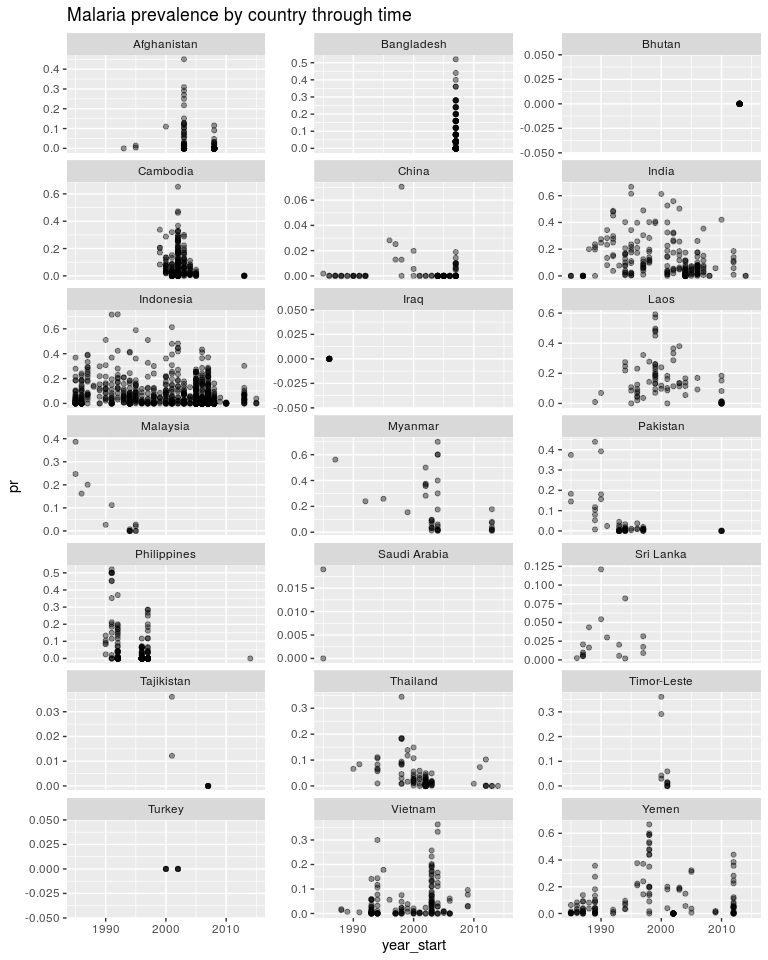
Note that Bhutan and Iraq have one data point each. Start thinking how you would estimate a temporal trend in those countries. As above, how do we estimate a temporal trend without it being dominated by the trend in Indonesia. The above mixed-effects model was called a random intercepts model. The “random” component was the iid country effect and we were estimating many intercepts. Now we will look at a random slopes models. The regression slopes will become our random component.
ggplot(dtime, aes(x = year_start, y = pr)) +
  geom_point(alpha = 0.4) +
  facet_wrap(~ country, scales = 'free_y', ncol = 3) +
  ggtitle('Malaria prevalence by country through time')
ggplot(dtime, aes(x = year_start, y = log_pr)) +
geom_point(alpha = 0.4) +
facet_wrap(~ country, scales = 'free_y', ncol = 3) +
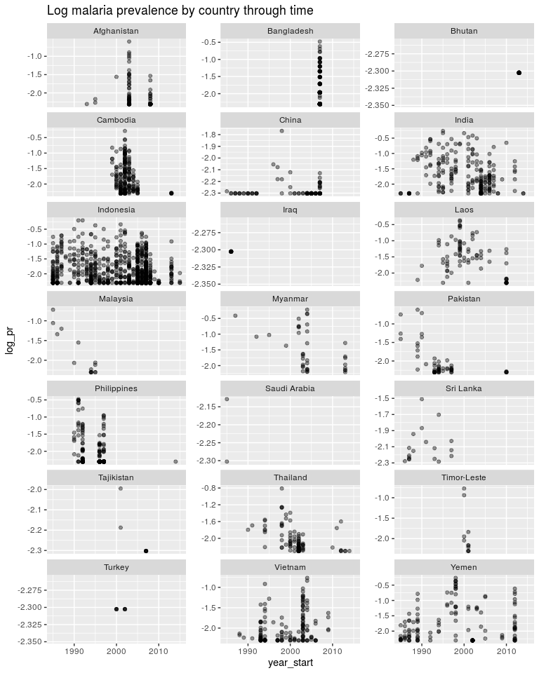
ggtitle('Log malaria prevalence by country through time')
Going back to least squares.
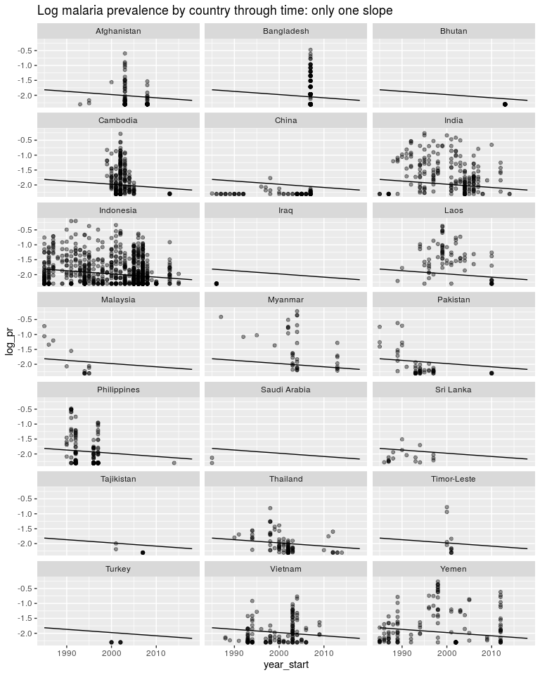
For question two we need to include a “year_start” term. The simplest model we can usefully do is a global year term and ignore country level lines.
y = β0 + β1yea**r
m3 <- lm(log_pr ~ year_start, data = dtime)
pred3 <- data.frame(dtime_pred, pred = predict(m3, newdata = dtime_pred))


ggplot(dtime, aes(x = year_start, y = log_pr)) +
  geom_point(alpha = 0.4) +
  facet_wrap(~ country, ncol = 3) +
  geom_line(data = pred3, aes(y = pred)) +
  ggtitle('Log malaria prevalence by country through time: only one slope')
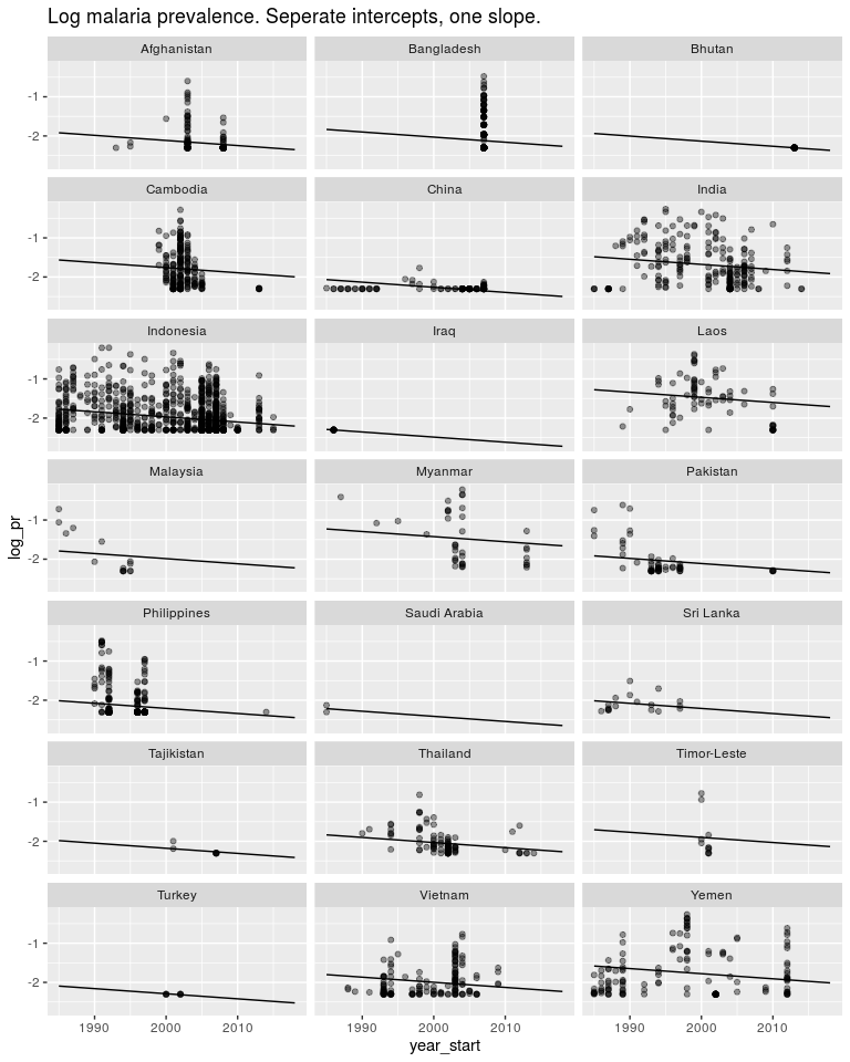
We could instead estimate a seperate intercept for each model but still only one slope. As above we would want this intercept to be a random effect but for now it isn’t. y = β0 + β1year* + *β*2.*AFG* + *β*3.*KHM* + *β*4.*CH**N + …
m4 <- lm(log_pr ~ year_start + country, data = dtime)
pred4 <- data.frame(dtime_pred, pred = predict(m4, newdata = dtime_pred))


ggplot(dtime, aes(x = year_start, y = log_pr)) +
  geom_point(alpha = 0.4) +
  facet_wrap(~ country, ncol = 3) +
  geom_line(data = pred4  , aes(y = pred)) +
  ggtitle('Log malaria prevalence. Seperate intercepts, one slope.')
Or we could estimate one slope and one intercept for each country as well as a global slope and global intercept. This model makes sense and let’s us answer the questions we are asking.
y = β0 + β1year* + *β*2.*AFG* + *β*3.*KHM* + *β*4.*CHN* + … + *β*5.*AFG*.*year + β6.KHM.year* + *β*7.*CHN*.*year + … Again, the variables AFG etc. are 1 if the data is in Afghanistan and 0 otherwise. So β5.AFG.year* will be zero if the datapoint is not in Afghanistan and will be *β*5.*year if the datapoint is inside Afghanistan.
We can fit this model with least squares.
m5 <- lm(log_pr ~ country + year_start:country , data = dtime)
pred5 <- data.frame(dtime_pred, pred = predict(m5, newdata = dtime_pred))

## Warning in predict.lm(m5, newdata = dtime_pred): prediction from a rank-
## deficient fit may be misleading

ggplot(dtime, aes(x = year_start, y = log_pr)) +
  geom_point(alpha = 0.4) +
  facet_wrap(~ country, ncol = 3, scale = 'free_y') +
  geom_line(data = pred5, aes(y = pred)) +
  ggtitle('Log malaria prevalence. Seperate intercepts and slopes.')
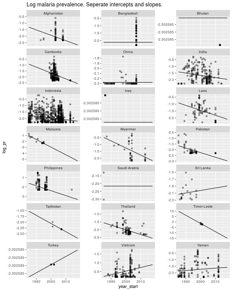
But the estimates in countries like Timor Leste are not very good. I don’t believe malaria is decreasing in Timor Leste 10x faster than in other countries. And I don’t believe Turkey is going through an epidemic. So as above, we have a model structure that is useful, but the way we are estimating our parameters is not very good. So first off let’s switch to a Bayesian model.
dtime_both <- bind_rows(dtime, dtime_pred)
pred_ii <- which(is.na(dtime_both$log_pr))


# This is all just messing around getting the priors together.
#  Not going to think about this too much, but we think malaria is going down.
names <- paste('country', unique(dtime$country), sep = '')
pmean <- c(rep(list(0), length(names)), -0.5) # 1 is the mean for intercepts,-0.5 is the mean for slopes.
names(pmean) <- c(names, 'default')
# 100 is the precision for the intercepts, 50 is the precision for the slopes.
pprec <- c(rep(list(0.1), length(names)), 0.001)
names(pprec) <- c(names, 'default')
priors <- list(mean.intercept = -2, prec.intercept = 1e-4,
               mean = pmean, prec = pprec)


b3 <- inla(log_pr ~ country + year_start:country , data = dtime_both,
            control.fixed = priors,
            control.predictor = list(compute = TRUE))
predb3 <- data.frame(dtime_pred, pred = b3$summary.fitted.values[pred_ii, 1])


ggplot(dtime, aes(x = year_start, y = log_pr)) +
  geom_point(alpha = 0.4) +
  facet_wrap(~ country, ncol = 3, scale = 'fixed') +
  geom_line(data = pred5, aes(y = pred), alpha = 0.3) +
  #geom_line(data = pred3, aes(y = pred), colour = 'blue', alpha = 0.3) +
  geom_line(data = predb3, aes(y = pred)) +
  ggtitle('Log malaria prevalence. Pooling priors') +
  ylim(-3, -0.5)

## Warning: Removed 26 rows containing missing values (geom_point).
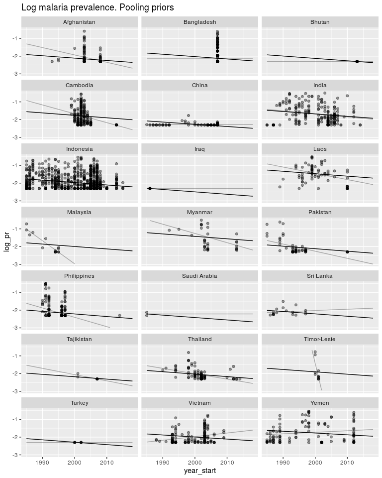
So as above, these priors have pushed both the slopes and intercepts to be much closer to the global mean. Again, same as above, we don’t know how similar the intercepts and slopes are to each other, so we let the data tell us.
Random Slopes
As before we have a model: y = β0 + β1year* + *β*2.*AFG* + *β*3.*KHM* + *β*4.*CHN* + … + *β*5.*AFG*.*year + β6.KHM.year* + *β*7.*CHN*.*year + … And we have priors that we don’t know how strong they should be. β3 − 4 ∼ Norm*(0, *σ**i**n**t**e**r**c**e**p**t*) *σ**i**n**t**e**r**c**e**p**t* ∼ some prior distribution *β*5 − 7 ∼ *Norm(0, σslope) σslope ∼ some prior distribution
And as above we can use penalised complexity priors.
dtime_both$country2 <- dtime_both$country # INLA needs us to copy this column

# We will put weak priors on the fixed effects. They can do what they want.
priors <- list(mean = list(year_start = -0.5, default = -2),
               prec = 1e-5)

hyper.intercept <- list(prec = list(prior="pc.prec", param = c(0.1, 0.01)))
hyper.slope <- list(prec = list(prior="pc.prec", param = c(0.1, 0.01)))

# For the formula we need year_start in for our global term.
# The global intercept is just the intercept and is included by default
f <- log_pr ~ year_start +
       f(country, model = 'iid', hyper = hyper.intercept) +
       f(country2, year_start, model = 'iid', hyper = hyper.slope)

mm2 <- inla(f, data = dtime_both,
            control.fixed = priors,
            control.predictor = list(compute = TRUE))


predmm2 <- data.frame(dtime_pred, pred = mm2$summary.fitted.values[pred_ii, 1])


ggplot(dtime, aes(x = year_start, y = log_pr)) +
  geom_point(alpha = 0.4) +
  facet_wrap(~ country, ncol = 3, scale = 'fixed') +
  geom_line(data = pred5, aes(y = pred), alpha = 0.3) +
  geom_line(data = predmm2, aes(y = pred)) +
  ggtitle('Log malaria prevalence by country through time. Random intercepts and slopes') +
  ylim(-3, -0.5)

## Warning: Removed 26 rows containing missing values (geom_point).
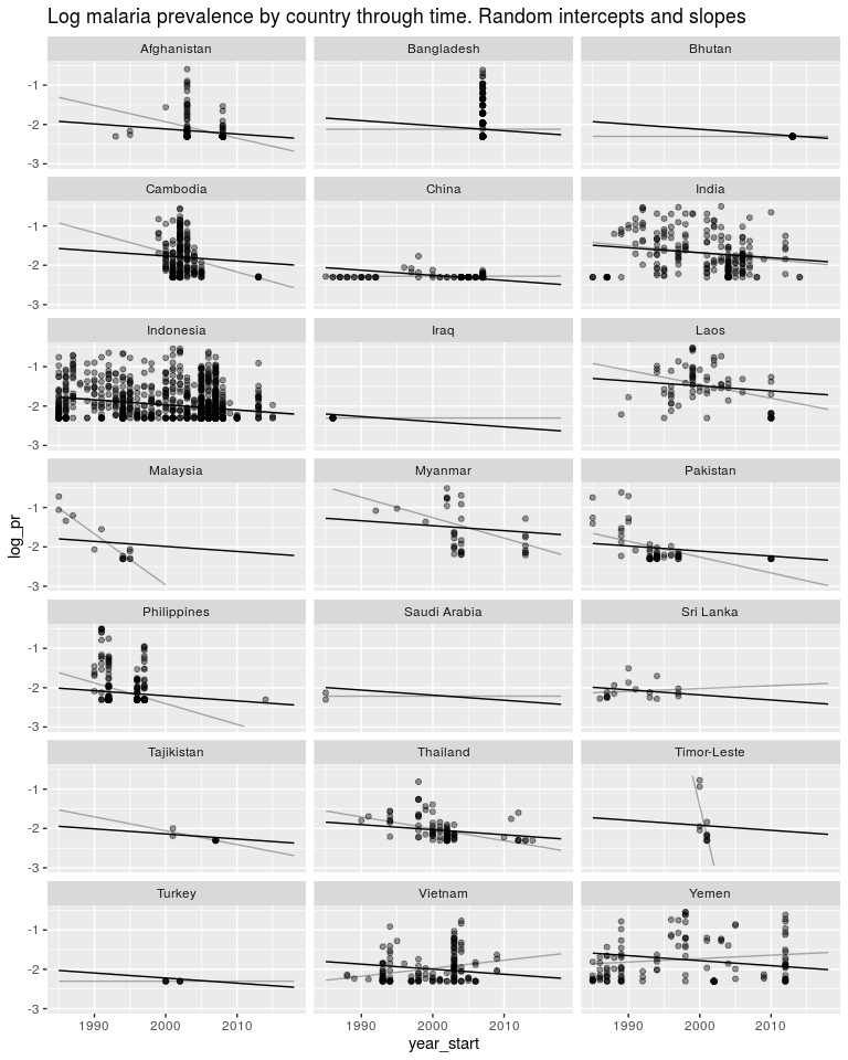
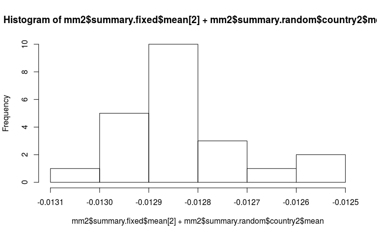
Now just some messing around to explore what we have fitted. Here is a plot of the random slopes we have fitted.
hist(mm2$summary.fixed$mean[2] + mm2$summary.random$country2$mean)
mm2$summary.hyperpar

##                                                 mean           sd
## Precision for the Gaussian observations 5.931078e+00 1.476931e-01
## Precision for country                   5.919402e+04 1.222777e+06
## Precision for country2                  5.794590e+07 2.128258e+07
##                                           0.025quant     0.5quant
## Precision for the Gaussian observations 5.645668e+00 5.929447e+00
## Precision for country                   1.287891e+02 3.612827e+03
## Precision for country2                  2.617741e+07 5.475057e+07
##                                           0.975quant         mode
## Precision for the Gaussian observations 6.226221e+00 5.926438e+00
## Precision for country                   3.463451e+05 2.206538e+02
## Precision for country2                  1.085916e+08 4.872095e+07
The estimated mean for the precision of the random slope component is 5e7. Therefore sd is $1/\sqrt{5e7} = 0.0001$. The data has told us that the declines in each country is pretty similar. Therefore the crazy slope in Timor-Leste is totaly unjustified.
Recap and practical advice
So, we have fitted a model for prevalence and a model for prevalence through time. In both cases we have many countries, and therefore many parameters. We want to put priors on these many parameters but don’t know how strong to make them. So we use a mixed-effect model to put a hyperprior on the prior.
These parameters can be intercepts or regression slopes. Everything works the same way but this can be confusing in the programming syntax. This is what we refer to as random intercepts and random slopes models.
So when are these models suitable? Given that the sole thing they do is change the estimates of these many parameters, we should focus on whether that makes sense in a particular case.
- We need to estimate σ, the between group variance. We therefore need many groups for this estimate to be any good. The number of countries we have here is on the lower side.
- If each group has loads of data, the prior will be ignored. So the benefit of mixed-effects models is reduced if every group has lots of data.
- These models can be used for different reasons. Perhaps we are estimating some global fixed effect but want to account for autocorrelation. Perhaps we are interested in the individual group estimates, but want to share information between groups.
Frequentist mixed models.
I really don’t understand frequentist models. They sort of do the same thing (estimating the variance of the random effect) but without priors. I dunno. Standard library is lme4 and you would do the above models like this.
library(lme4)

f1 <- log_pr ~ (1 | country)
mm3 <- lmer(f1, data = dmean)

coefficients(mm3)

## $country
##             (Intercept)
## Afghanistan   -1.984396
## Cambodia      -1.765873
## China         -2.250998
## India         -1.793234
## Indonesia     -1.810567
## Laos          -1.455991
## Myanmar       -1.473185
## Tajikistan    -1.973589
## Thailand      -2.142186
## Timor-Leste   -1.905138
## Turkey        -2.192474
## Vietnam       -1.850997
## Yemen         -2.020359
##
## attr(,"class")
## [1] "coef.mer"

fixef(mm3)

## (Intercept)
##   -1.893768

f2 <- log_pr ~ year_start + (year_start | country)

mm4 <- lmer(f2, data = dtime)

## Warning in checkConv(attr(opt, "derivs"), opt$par, ctrl = control
## $checkConv, : unable to evaluate scaled gradient

## Warning in checkConv(attr(opt, "derivs"), opt$par, ctrl = control
## $checkConv, : Model failed to converge: degenerate Hessian with 1 negative
## eigenvalues

coefficients(mm4)

## $country
##              (Intercept)  year_start
## Afghanistan     23.86207 -0.01298811
## Bangladesh      23.74080 -0.01288552
## Bhutan          23.86637 -0.01299368
## Cambodia        23.37922 -0.01257206
## China           24.04296 -0.01314883
## India           23.26472 -0.01247322
## Indonesia       23.66311 -0.01281644
## Iraq            24.24638 -0.01332219
## Laos            22.99958 -0.01224425
## Malaysia        23.68770 -0.01283863
## Myanmar         22.96536 -0.01221494
## Pakistan        23.85269 -0.01297997
## Philippines     23.99380 -0.01310051
## Saudi Arabia    23.95024 -0.01306647
## Sri Lanka       23.95157 -0.01306773
## Tajikistan      23.88800 -0.01301237
## Thailand        23.74605 -0.01288867
## Timor-Leste     23.58755 -0.01275329
## Turkey          24.00437 -0.01311285
## Vietnam         23.67971 -0.01283811
## Yemen           23.36557 -0.01257216
##
## attr(,"class")
## [1] "coef.mer"

fixef(mm4)

## (Intercept)  year_start
##  23.7018017  -0.0128519
R is complaining about not being able to fit the model properly. I don’t know why.
Check this paper for more. https://www.ncbi.nlm.nih.gov/pmc/articles/PMC5970551/
]]>