Figure Archive
Published:
Terrible figure archive. 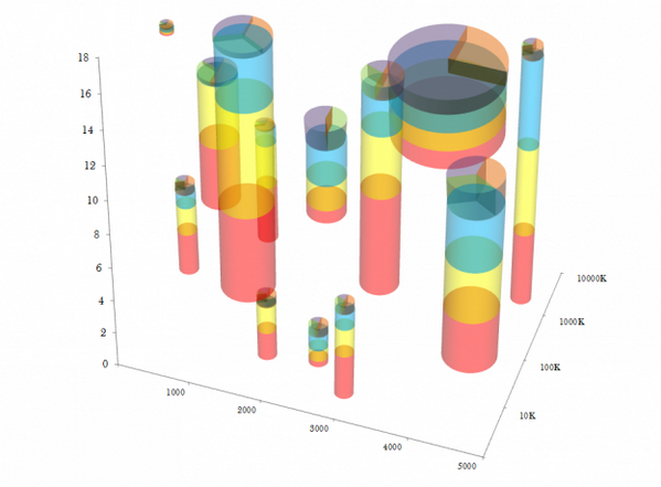
I’ve been collecting and posting bad figures for a while now. I’ll keep this page up to date with the figures that I post. Unfortunately it turns out the header figure was a hoax.
The figures
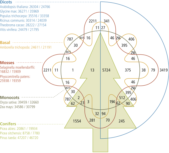
A venn diagram. Ugh. Because of the shape, there’s many regions that represent the same groups. Unfortunately they got the numbers wrong e.g. 79 and 341 for Early land + Dicots. These errors are corrected for the online paper.
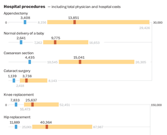
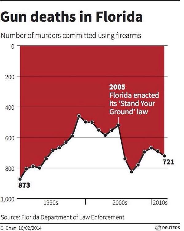
A number of issues here. The numbers should be rounded. Because they aren’t, the placing is poor. Some are below the bars while some are alongside. The ones below the bars aren’t centered on the spot they are labelling. For some reason (and not clearly indicated) the cream bars are the 25th to 95th percentile. Sounds like classic data visualization lies to me. Finally, I don’t know that joining the 30,000 point on the right hand side with a verticle line is useful.
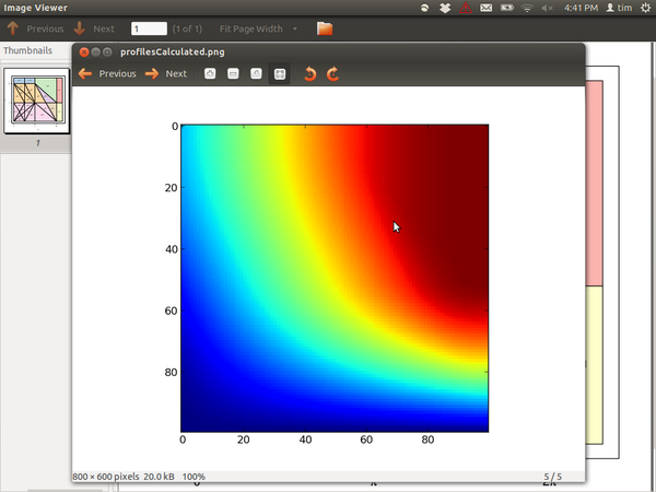
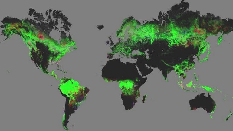
The default colours in matplotlib are rubbish. This is just a smoothly varying value, but there’s so many artifacts. It artificially splits the data into four or five regions (blue, light blue, yellow, orange, red). There’s also very strong bands (light blue band, yellow band, orange just before dark red band).
Check that Y-axis. I think it’s supposed to look like blood dripping down a wall. But it’s just bad.
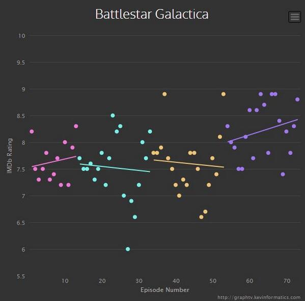
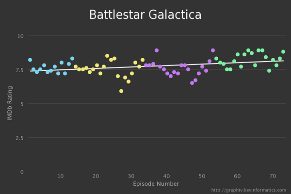
A cool online thing to get IMDB ratings data and plot them. Terrible is certainly way too strong here, but I think the second image (mine) is much better.
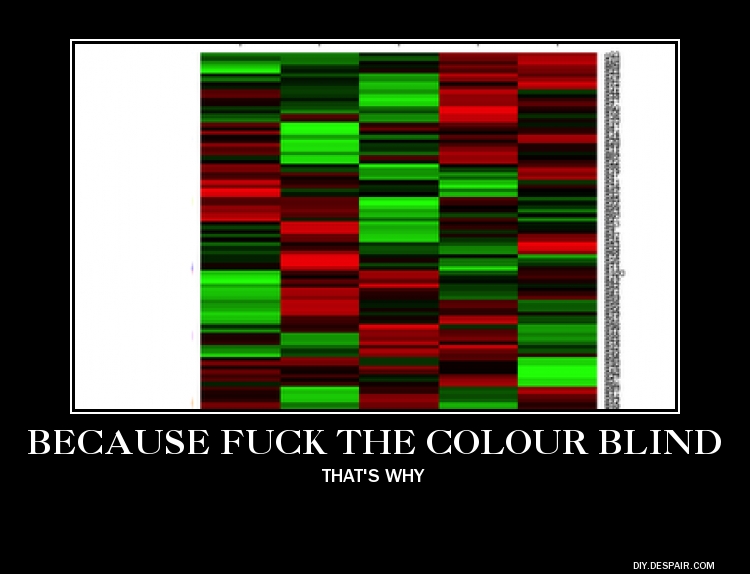
Colour blind unfriendly
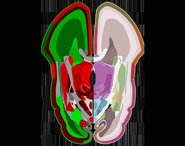
Starting with this map of the brain. The irony being that of all people, neuroscientists should be aware of colour blindness.
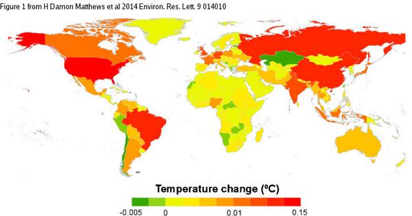
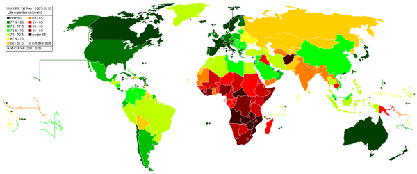
Turns out red and green is a really common, and terrible colour combination for maps.
And of course, gene expression matrices.