Measlesdataviz
Published:
Working through visualising the effects of the measles vaccine. 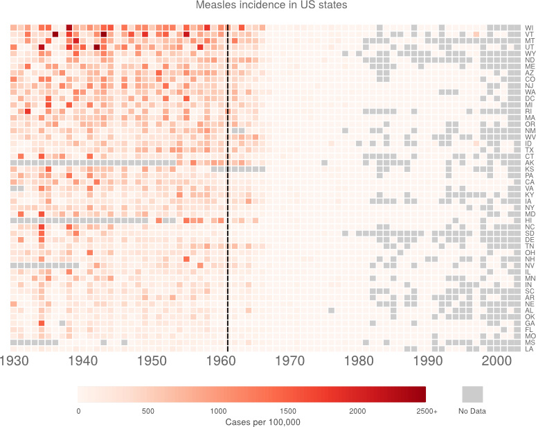
Visualising the effects of the measles vaccine
First there was the Wall Street Journal vizualisation
Then @RobertAllison__ redrew the plot.
Then @biomickwatson recreated the plot. Finally, @benjaminlmoore recreated the plot in ggplot2.
So I thought I’d have a go as well. I’ve downloaded the incidence data from the Tycho website. http://www.tycho.pitt.edu/l1advanced.php You have to register and stuff. I also deleted the first two rows with titles in.
Before I start, my aims:
- No funky colour ramps. Let the data speak for itself.
- Distinguish between missing data and zeros.
- I’m considering reordering the states. Perhaps largest states at the top? Or high measles burden at top.
The code
The code is available as an Rmarkdown document on github.
So, read in data. Then shamelessly copy code from @biomickwatson to get to a decent starting point.
To go from weekly data to annual, I am taking the mean across the year (with NAs removed). As pointed out by @RobertAllison__, if you sum the data, the NAs introduce a bias. So I am taking the mean, then multiplying back by 52. To get expected cases per 100,000, per year.
library(gplots)

m <- read.csv('MEASLES_Incidence_1928-2003_20150409110701.csv', stringsAsFactors = FALSE)

# yoink. Cheers @biomickwatson
m[m == "-"] <- NA
for (i in 2:NCOL(m)) {
   m[, i] <- as.numeric(m[, i])
}

m <- m[m$YEAR>=1930,]
y <- aggregate(m[,3:NCOL(m)], by=list(year=m[,1]), function(x) 52*mean(x, na.rm = TRUE))

for (i in 1:NCOL(y)) {
   y[is.nan(y[, i]), i] <- NA
}


y <- y[order(y$year),]


row.labels <- rep("", 72)
row.labels[c(1,11,21,31,41,51,61,71)] <- c("1930","1940","1950","1960","1970",
                                           "1980","1990","2000")

cols <- colorRampPalette(c("red", "blue"))(100)
bks <- seq(0, max(y[, -1], na.rm = TRUE), length.out = 101)


par(cex.main=0.8)

heatmap.2(as.matrix(t(y[,2:NCOL(y)])), Rowv=NULL, Colv=NULL,
        dendrogram="none", trace="none", key=FALSE,
        labCol=row.labels, cexCol=1, lhei=c(0.15,1), lwid=c(0.1,1), margins=c(5,12),
        col=cols, breaks=bks, colsep=1:72, srtCol=0, rowsep=1:57, sepcolor="white",
        add.expr=lines(c(32,32),c(0,1000),lwd=2),
        main='Measles cases in US states 1930-2001\nVaccine introduced 1961
             \n(data from Project Tycho)')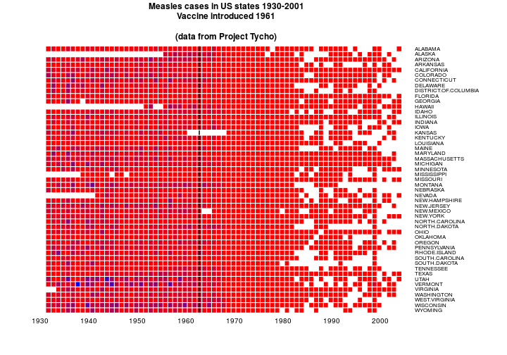
OK. NA’s are white. Other colours are ramped. That’s good. The colour ramp here is funny because I’m using @biomickwatson’s values which match the cases data rather than the incidence data.
I like the labels on the right so I’ll leave that.
Now to get some good colours. I might try and leave NA’s white and have a ramp that doesn’t include white. RColorBrewer asseeeeemble.
Also going to change to 2 letter state names. The csv is just a list copied from the web.
library(RColorBrewer)

stNames <- read.csv('stateNames.csv', header = FALSE, stringsAsFactors = FALSE)

names(y)[2:52] <- stNames[,2]


cols <- colorRampPalette(brewer.pal(8, 'Reds'))(100)
bks <- seq(0, max(y[, -1], na.rm = TRUE), length.out = 101)

par(cex.main=0.8)
heatmap.2(as.matrix(t(y[,2:NCOL(y)])), Rowv=NULL, Colv=NULL,
        dendrogram="none", trace="none", key=FALSE,
        labCol=row.labels, cexCol=1, lhei=c(0.15,1), lwid=c(0.1,1), margins=c(5,12),
        breaks=bks, colsep=1:72, srtCol=0, rowsep=1:57, sepcolor="white", col=cols,
        add.expr=lines(c(32,32),c(0,1000),lwd=2),
        main='Measles cases in US states 1930-2001\nVaccine introduced 1961', na.color = grey(0.8))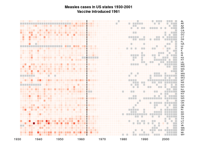
As suggested by @bulboussquidge I’ll try just clipping the few high values to a something+ category.
hist(as.matrix(y[,1:NCOL(y)]))
y2 <- y[, 2:NCOL(y)]
sum(y2[!is.na(y2)] > 2500)y2[y2 > 2500] <- 2500
cols <- colorRampPalette(brewer.pal(8, 'Reds'))(100)
bks <- seq(0, max(y2, na.rm = TRUE), length.out = 101)
par(cex.main=0.8)
heatmap.2(as.matrix(t(y2)), Rowv=NULL, Colv=NULL,
dendrogram="none", trace="none", key=FALSE,
labCol=row.labels, cexCol=1, lhei=c(0.15,1), lwid=c(0.1,1), margins=c(5,12),
breaks=bks, colsep=1:72, srtCol=0, rowsep=1:57, sepcolor="white", col=cols,
add.expr=lines(c(32,32),c(0,1000),lwd=2),
main='Measles cases in US states 1930-2001\nVaccine introduced 1961', na.color = grey(0.8))
Only 3 data points are affected. I’m torn here.
Now I want to try organising the data by measles burden. The areas with lots of measles are the important bit, so I think that makes sense. I think I’ll just do mean (with NAs removed) and order by size. Certainly a useful thing could be to order by number of cases rather than incidence. But I don’t want to go get the other dataset.
means <- apply(y2, 2, function(x) mean(x, na.rm = TRUE))

y3 <- y2[, rev(order(means))]


par(cex.main=0.8)
heatmap.2(as.matrix(t(y3)), Rowv=NULL, Colv=NULL,
        dendrogram="none", trace="none", key=FALSE,
        labCol=row.labels, cexCol=1, lhei=c(0.15,1), lwid=c(0.1,1), margins=c(5,12),
        breaks=bks, colsep=1:72, srtCol=0, rowsep=1:57, sepcolor="white", col=cols,
        add.expr=lines(c(32,32),c(0,1000),lwd=2),
        main='Measles cases in US states 1930-2001\nVaccine introduced 1961', na.color = grey(0.85))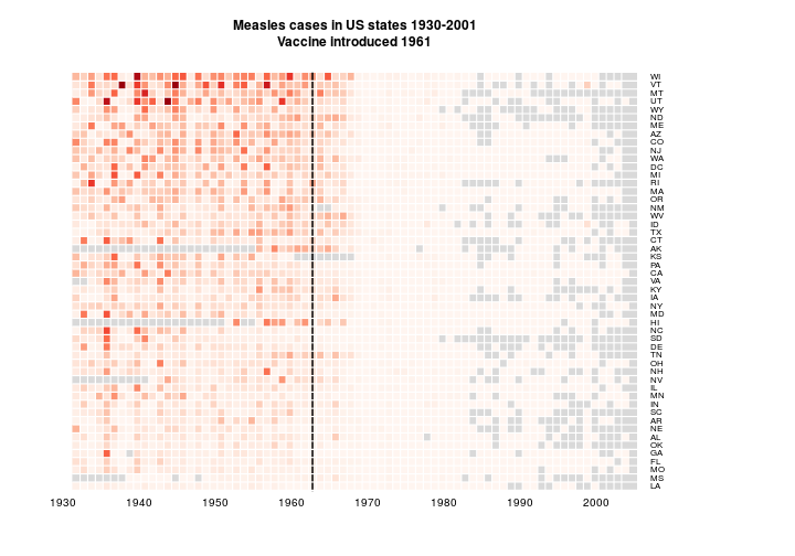
I think the reordering is an improvement. It’s interesting at least.
Finally, I just want to tweak a few things. This turns out to be a complete pain. I had ago hacking heatmap.2(). The new function is saved in customHeatmap.R.
source('customHeatmap.R')

customHeatmap(as.matrix(t(y3)), Rowv=NULL, Colv=NULL, lmat = rbind(c(0,3),c(2,1),c(0,4)),
        dendrogram="none", trace="none", key=TRUE,
        labCol=row.labels, lhei=c(0.15,1,0.25), lwid=c(0.1,1), margins=c(3,6),
        breaks=bks, colsep=1:72, rowsep=1:57, sepcolor="white", col=cols,
        add.expr=lines(c(32,32),c(0,1000),lwd=2),
        main='Measles incidence in US states', na.color = grey(0.8),
        density.info = 'none', RowLabColors = grey(0.4), cexCol = 1.3, key.title = '',
        cexRow = 0.65, ColLabColors = grey(0.4), key.xlab = 'Cases per 100,000', titleColor = grey(0.4), key.par = list(col = grey(0.6), lwd = 0.1 )
        )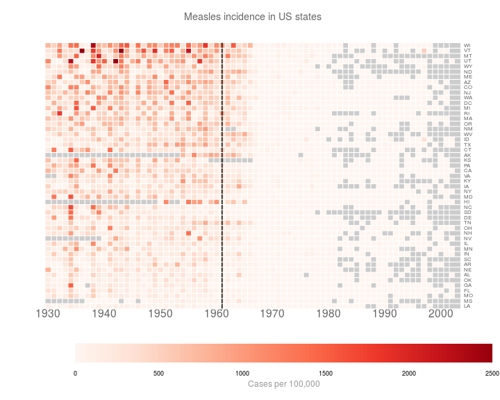
At this point, I’m bored of hacking. I’m just going to make the last few changes in inkscape.
Which gives me:

Still not perfect. But I’m bored now.
